
The traditional Viridian pigment, PG18, is one of those classic older chemical pigments invented in the 19th century, around the same time as the cadmiums and chromiums. The name is based on the Latin name veridis, meaning green. This is a granulating cool (blue-toned) green shade. It tends to be low-tinting strength and very liftable.
Experiment Results
Gradient: Pretty, granulating, blue-toned green ranging from deep jade to pale mint. Like many highly granulating colors, it’s not easy to grade evenly, and tends to fall in streaks. The masstone is very difficult to get and requires lots of charging.
Granulation: Highly granulating! I’m really pleased with the chaotic granulation from the W&N version.
Opacity: Pretty darn transparent.
Glazing: A deeper shade of rich green.
Comparison to Other Colors
Phthalo Green Blue Shade (PG7)

The bright, bold, blue-green hue of PG18 viridian is almost identical to Phthalo Green Blue Shade (PG7). But the properties are extremely different in basically every way!
- Intensity: PGBS is super-strong and gets incredibly dark, and has a tendency to overwhelm mixes. The darkest, deepest, I-dug-my-brush-in-for-fifteen-minutes masstone of Viridian is sort of like if you waved your brush NEAR a pan of PGBS.
- Granulation: Viridian tends to be highly granulating, and PGBS is utterly smooth.
- Staining: Viridian is liftable, PGBS is highly staining.
Both are transparent, so there’s that!
Comparison to Other Brands
For more complete comparisons, see video comparisons by Oto Kano, Jaime Anderson, and Kim Crick.
Be careful; some brands, like Holbein, have a Viridian Hue that is actually PG7 and Mission Gold literally just calls their PG7 “Viridian” !
Daniel Smith – Viridian

Granted that I made this color swatch about six months before the WN one, and I improved my swatching skills in the meantime, but I found Daniel Smith’s Viridian a lot harder to wring a masstone from. It’s just very weak and dries very, very hard.

I’m also disappointed that the granulation wasn’t as striking as some DS colors (or as the WN Viridian). The unmixed color and the mixes I got were only slightly granulating. The whole point of traditional PG18 Viridian is the granulation, IMO!
Schmincke Horadam – Viridian (PG18)
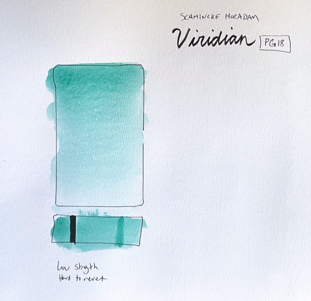
Didn’t even finish doing color mixes or anything here, I found this so weak that it was unenjoyable to use. I think this is par for the course for most Viridians; the WN is looking better and better by comparison.
Color Mixes
I love the wild granulating mixes!
Monte Amiata Natural Sienna (PBr7)

A touch of Viridian gives a mossy quality to the MANS, and a touch of MANS makes the Viridian a bit yellower and more natural-looking as a foliage green.
Yellow Orange (PY110)

While the mixes high in PY110 aren’t my favorite, just a tiny touch of PY110 can tip the Viridian into a yellower, grassy, leafy color as well as mute it a bit so that it becomes a lovely foliage color.
Van Dyke Brown

Highly granulating, blackish-green mixes.
Transparent Orange
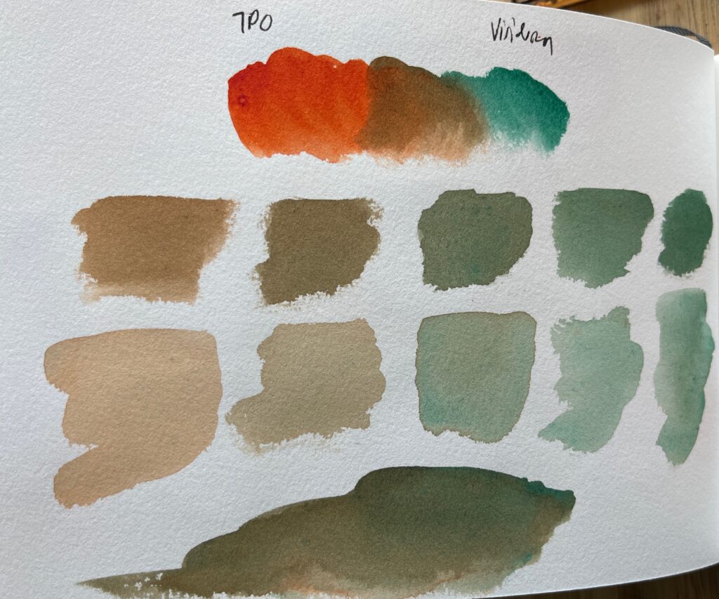
An interesting range of tans and copper-with-patina bornw-greens, with floating viridian granulation. Also looks a lot like peering into a muddy pond. Like, literally muddy, but still cool-looking, in my opinion.
Perylene Maroon

A range of red-browns to gray-browns; I found it hard to get a greenish color because the Perylene Maroon is so much more pigmented than the Viridian.
Quinacridone Rose

A weird mix! Quin Rose-ish colors should be complementary, but the Viridian floats above the pink, so it never quite becomes gray so much as “pink and green at the same time.”
Indanthrone Blue
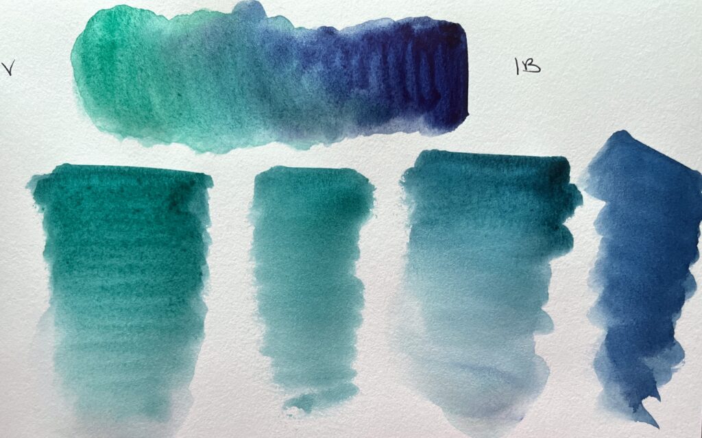
Muted blue-green, teal, and green-blue shades.
Ultramarine Blue

Bright, granulating colors in jade to turquoise to peacock blue shades.
Cobalt Blue
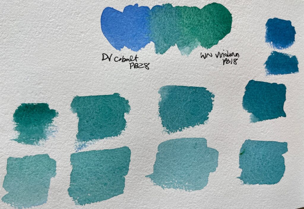
Bright granulating turquoises. Cobalt is greener than Ultramarine, so there’s less variation here.
Rich Green Gold (PY129)
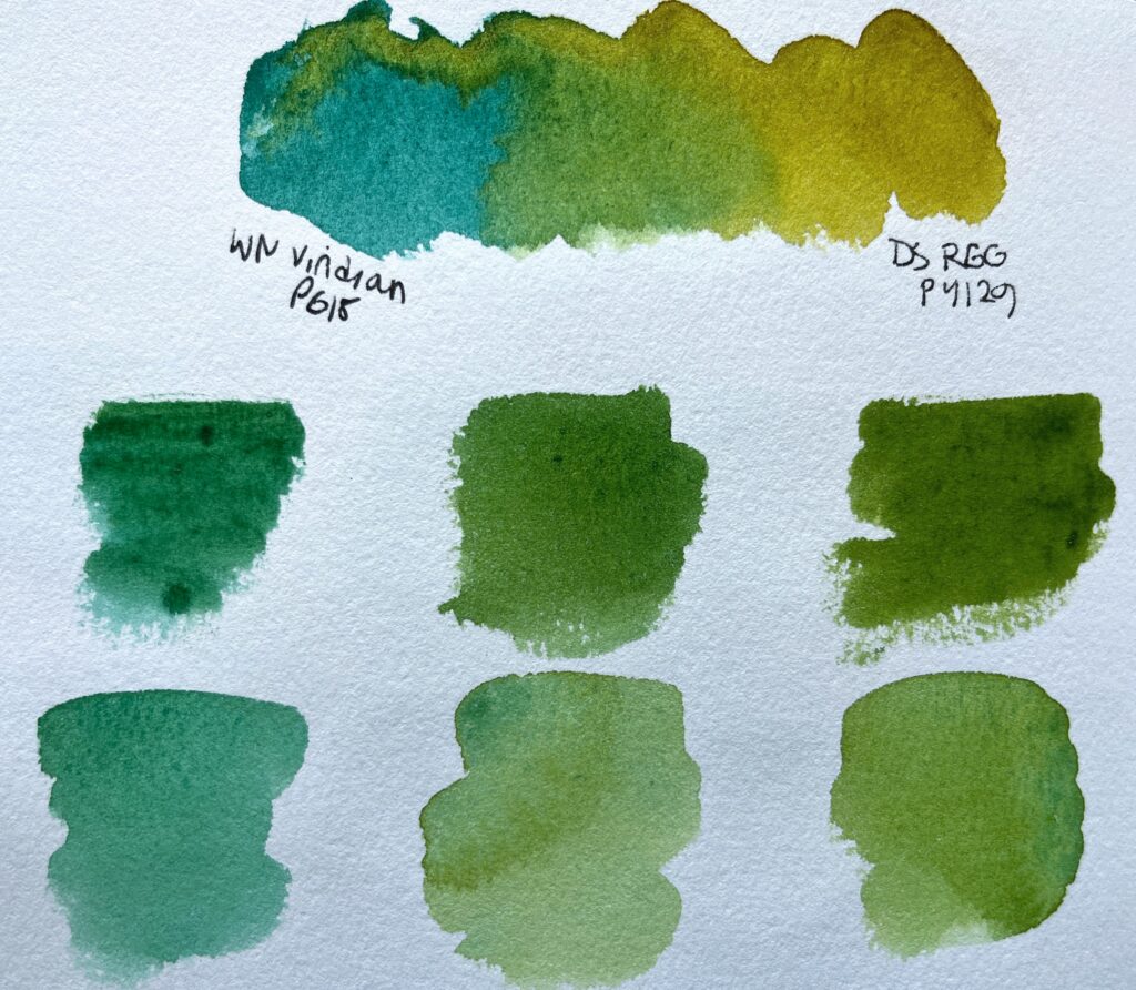
Super-dispersive RGG tries to take over the Viridian gradient. The mixes are quite nice foliage colors in my opinion. I think they look a really realistic for leaves.
What Others Say
Top 40 pigment… Viridian was formerly the most common watercolor green, used by past masters such as J.S. Sargent and John Marin, and by contemporary traditionalists such as Trevor Chamberlain. It creates a glowing, granulating green in the right concentration and setting — Sargent’s use of it in a backlit parasol is perfect. It is now commonly replaced by the darker, more saturated and staining phthalo green (PG7), but especially for landscape work viridian has many good points, though it is a pigment that requires experience to use effectively. (Viridian paints need patient mulling with the brush to dissolve completely; if you are careless your washes can be streaked by tiny dark clots of undissolved pigment, and the paints require patient rewetting if they have dried. Mixtures must be frequently stirred to keep the viridian from settling out. The paint’s granulation is put to best effect in diluted, near neutral mixtures, and works well with flocculating ultramarine blue … and so on.)
Bruce MacEvoy, handprint.com
Although very similar in hue, Viridian is a much less powerful green in mixes than Phthalo Green. It is also granulating and non staining. It won’t make the same wonderful blacks that can be created by mixing phthalo green with a crimson, bit it will make granulating colours that can be lifted out. It is a tricky pigment to make into a paint it seems, and may take a little more pre-wetting than most colours before use. I add a drop of glycerine to this in the palette and stir well to make rewetting easier.
Jane Blundell, Green Watercolor Swatches
A very odd color. It is very pale (low concentration/ saturation of color) and once dry in my palette pans it definitely takes more agitation of the brush to re-wet. It also granulates and tends to get dominated easily in mixtures because of its low saturation. I could get a similar color with a very diluted Phthalo Green Blue Shade, but this would miss out on the unpredictable granulation and settling that happens when it is mixed or dropped into an area wet-in-wet. It also happens to be a dead-on match for the unusual green color of a certain layer of the mud-stone Bentonite I encountered on numerous hikes.
Claire Giordano, “Fall in the Southwest: Favorite Colors”
My Review of Viridian
I initially disliked Viridian because it’s so weak, and can’t really stand up to the brighter bolder colors in my palette (e.g. Phthalo Blues and Quin Rose). Phthalo Green is a better match for those colors. But my palette has tended more granulating over time, and I’ve gotten more patience with weaker colors. I also switched from the DS to the WN version of Viridian, which is both easier to rewet and more granulating, so it handles more nicely and shows off the granulating superpowers of Viridian better! I now find Viridian to be a wonderful foliage mixer and magic-maker.
If the granulation isn’t important to me, I will tend to opt for Phthalo Green (PG7) as it is the same hue, but much stronger and cheaper.
On my palette? I have the WN version in my color library, but it’s not on any of my dry plein air palette mixes because it’s better from the tube than from dry (though WN is usable from dry, just on the low end).
Favorite version: WN much preferred.